When I first tried Home Assistant a few years ago, I was impressed by the functionality, but the default interface left a lot to be desired. That was only until I discovered what some people in the community were able to do with their projects. Here is a small collection of some of the best Home Assistant interfaces I have discovered.
If you are looking to build your dashboard, Home Assistant is not the only option (although it offers the most flexibility). You can find more information about other platforms in this article:
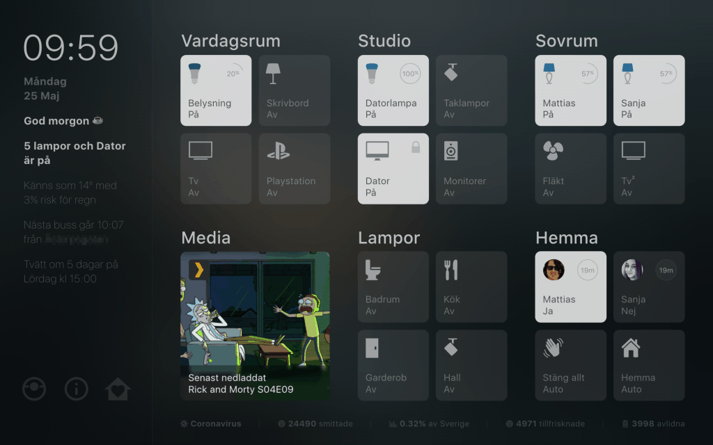
1. Mattias Persson’s Tablet Interface
Source: https://github.com/matt8707/hass-config
This is truly an impressive piece of work. Very clean tablet interface with custom icons, animations, sounds, and custom pop-up cards. You can read through the full code at Matt’s Github and admire his CSS coding skills.
2. Lovelace Soft UI
Source: https://github.com/N-l1/lovelace-soft-ui
Very clean interface and a simple template for your projects. This interface comes in both, light and dark versions, and allows you to switch easily between the two. I also liked the idea of a live search box at the top to quickly find entities that are not exposed on the front page.
3. Lukevink’s Floor Plan UI
Source: https://github.com/lukevink/hass-config-lajv
You can find hundreds of different variations of Home Assistant floor plans, but I found this one to be the most functional as well as aesthetically pleasing. Individual rooms change brightness and color based on which lights are currently on and the floorplan dynamically adjusts brightness based on the calculated brightness of the sun. It also comes with a custom vacuuming view (see above).
